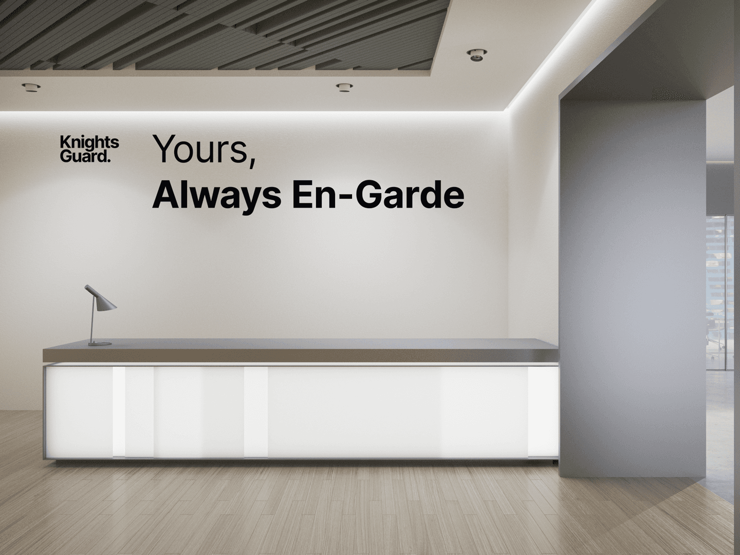
Knights Guard: Brand Built on Unwavering Protection
Project Scope
Creative Direction
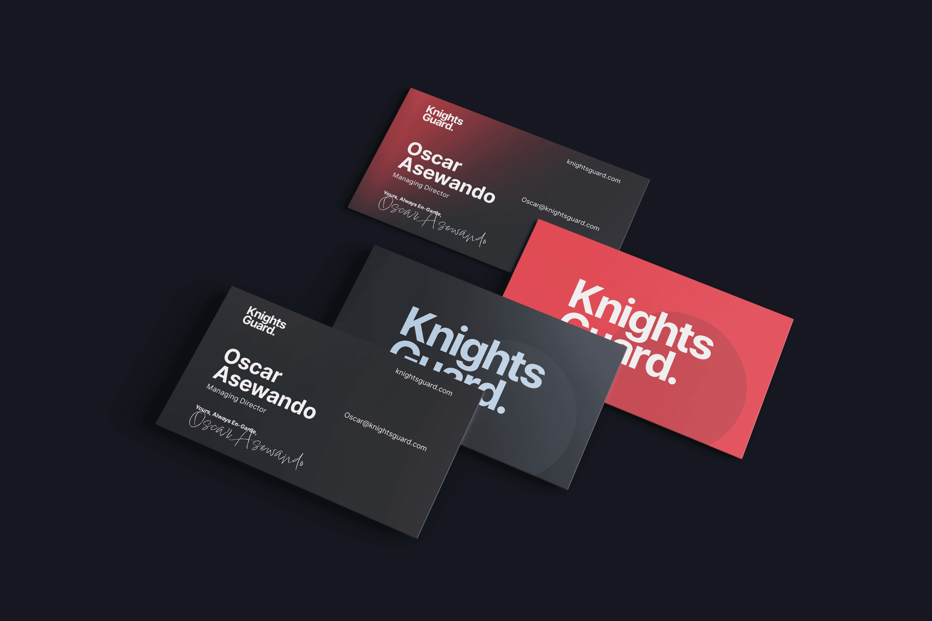
Brand Identity
Brand Guidelines
Advertising
Social Media Assets
Client
Knights Guard
The Process
In a world of uncertainty, high-net-worth individuals and family offices seek more than just security. They demand absolute trust, discretion, and expertise. Knights Guard was envisioned to meet this need, offering a sanctuary of calm and control for those who prioritize their assets, privacy, and peace of mind. Designed for a discerning clientele, sophisticated individuals aged 45-60, often with backgrounds in finance or management, Knights Guard delivers protection that feels both personal and impenetrable.


Knights Guard: Brand Built on Unwavering Protection
Project Scope
Creative Direction
Brand Identity
Brand Guidelines
Advertising
Social Media Assets
Client
Knights Guard
Knights Guard: Brand Built on Unwavering Protection
Project Scope
Creative Direction
Brand Identity
Brand Guidelines
Advertising
Social Media Assets
Client
Knights Guard
Next Project

Next Project

Ready to Become
Extraordinary?
Ready to Become
Extraordinary?
Reach out to see how I can elevate your brand
above the competition with unmatched design
and strategy. Let’s redefine what’s possible.
Reach out to see how I can elevate your brand above the competition with unmatched design and strategy. Let’s redefine what’s possible.
Creating The Extraordinary
Based in London UK, elevating brands worldwide
Email: Norbert@goatvisuals.co.uk
© 2026 Goatvisuals. All rights reserved.
Creating The Extraordinary
Based in London UK, elevating brands worldwide
Email: Norbert@goatvisuals.co.uk
© 2026 Goatvisuals. All rights reserved.
Ready to Become
Extraordinary?
Reach out to see how I can elevate your brand
above the competition with unmatched design
and strategy. Let’s redefine what’s possible.